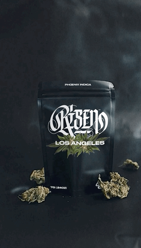
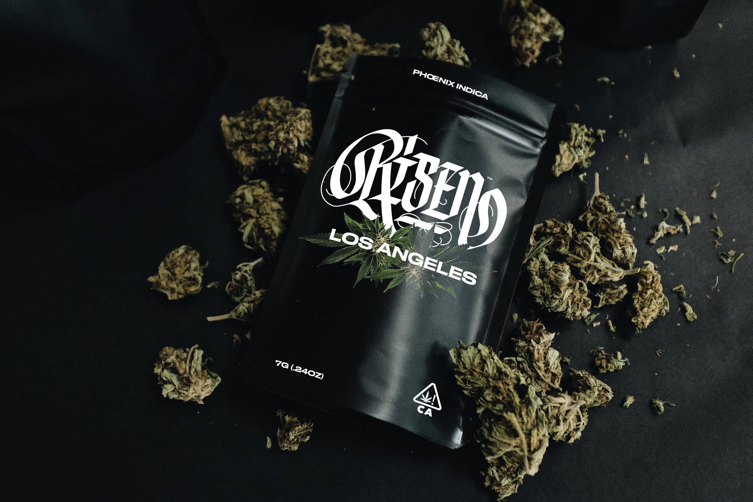
Risen Los Angeles
Branding|Creative Direction

“BORN FROM ASHES”
Creating logos and branding is every time an exciting adventure. It is even more thrilling when starting from scratch. Risen Los Angeles trusted me to develop the brand from the beginning.
I wanted to create a handmade logo to stand out from the concurrence and tell a story, Risen’s story. Risen means to me the rebirth of a classic, a phoenix born from white ashes, the holy grail of Cannabis.
I paired classic iconography with an unique handmade lettering touch. Infusing renaissance street cred into the premium cannabis strain brand that Risen is. The brand had to feel and look epic to stand out and be elevated to the rank of icon.


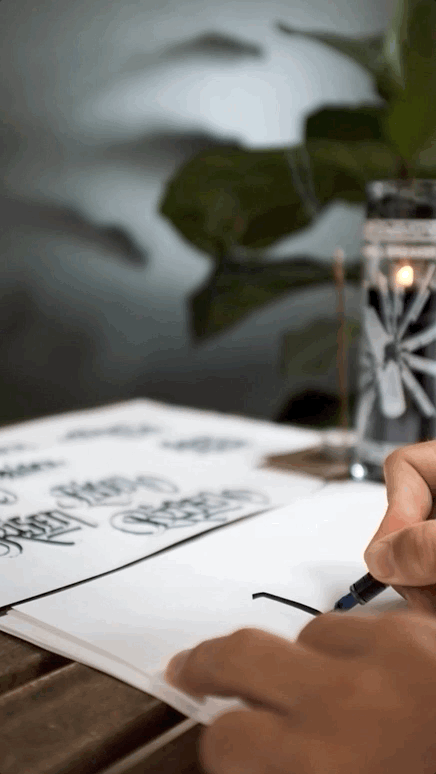
BEHIND THE SCENES - LOGO DEVELOPMENT
Here are the initial researches to find a correct balance with letterforms, From the initial sketch, I re-drawn the letters clean so to keep the handmade feel and dynamism of the letters but still have a premium feel.


Et voilà! A Brand is born.

crediTS
Branding, Photography: Benoit Ollive
Client: Risen Los Angeles